
Color Picker Guide for Photoshop Painters - Part 2
I'll be the first to admit - when it comes to art, there are no hard and fast rules, no "right", and no "wrong". However, there are best practices that are generally applicable to many of our creations.
If you carefully analyze the brush strokes of the old master oil painters, you'll often find colors that range from cool to warm. This is known as color temperature. Varying the color temperature gives their paintings interest and helps to keep the viewer's attention. Historically, painters used either lamp light or the sun to illuminate their subject. The warmth of their light source resulted in cooler shadows in their paintings.
As photographers, we most often balance our light source to be as neutral as possible because, in this day and age, color casts are considered undesirable. Generally speaking, this results in our subjects having cool highlights and warm shadows.
There is no right or wrong for warm versus cool. There just needs to be a good balance of each and ideally, you should be able to identify if your light source is warm or cool.
As digital artists, we need to understand how to accomplish the balance between warm and cool while working with a photographic reference. In this blog, we'll explore one method for selecting highlight and shadow colors in the color picker and we will be assuming the light source is neutral which results in warm shadows and cool highlights.
While this shouldn't be considered the ONLY way, it is a reliable method for beginners as they develop their eye to see warm and cool colors.
I'm going to reiterate again - there is no "right" or "wrong" here. I'm giving you some general observations about the old masters versus the work we, as modern digital artists, do today. These general observations may not ring true with EVERY artist in history. However, the guidelines below should give you success as a beginner.
Remember, next to lighting, color helps set the tone and mood of your portrait so learning to make deliberate choices will help strengthen your art.
What NOT to do...
When I teach beginning painters that have no artistic background, they almost always do the same thing...
If they need a highlight color, they go straight up in the color picker box.
If they need a shadow color, they go straight down in the color picker box.
NO, NO, NO, NO, NO for all that is good and right in this world -- PLEASE NO!

Any time you go straight up and down in the color picker box you're changing color families.
Going straight up in the box results in what looks like a very bad use of the dodge tool. The highlights look unnaturally saturated and intense. Especially if the color ends up being picked from the upper 'no man's land'.

Going straight down in the color picker box is equal to adding black paint. It muddies your colors and results in dull, lifeless paintings that lack impact.
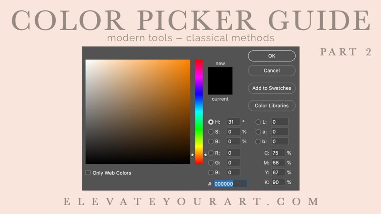
What you should do is follow the value line...

The value line is an imaginary line that runs diagonally across the color picker box like this...

By following the value line, your shadow colors will automatically be opposite of your highlight colors in temperature. This will give balance and interest to your paintings.
Practical Application
In this chart, I began with a single flesh tone and by either going up and down (in the red box) or following the value line (in the white box), I made a palette of flesh tones in the color picker.
On the right side of the chart, I followed the value line when making my choices. These colors are lifelike and natural.

On the left side of the chart, I went up and down in the color picker, changing color families, muddying my shadow colors, and unnaturally saturating my highlights.
Making this one simple change in how you choose a highlight or shadow color can change the perception of your work as a photographic artist. Having the ideal balance between warm and cool color temperatures in your work will instantly elevate you from the amateur ranks of digital painters to someone respected for their professional attention to painting detail.
If you missed the first article in the color picker series, you'll want to catch up with the information in that article by clicking the image below. Hint: Stay out of 'no man's land'! 😉

https://www.elevateyourart.com/blog/color-picker-part-1
Happy painting!
Stay connected with news and updates!
Join the mailing list to receive the latest news and updates from my team.
Don't worry, your information will not be shared.
I hate SPAM. I will never sell your information, for any reason.


